I was thinking:
The Latin script is relatively simple (especially the Upper Case) – deffo easier to learn & write than many other writing systems. But that doesn’t mean it cannot be simplified further. For example: with a number of letters, you have to lift the pen from the paper (e.g. A, T, X) and sometimes more than once (e.g. E, H, P). Also, there are letters that have many sharp points (like M, W). So, how about trying to get rid of as much of this as possible, while keeping the letters reasonably recognizable?
Therefore, the task: make Latin script-based font where
- in any given letter, you can write it with one sweep, no need to lift the pen from the paper; and
- reduce the number of sharp points (“points where 1st derivative does not exist”) to 1 per letter maximum.
Well, here’s the result (incl. a few sample sentences)!
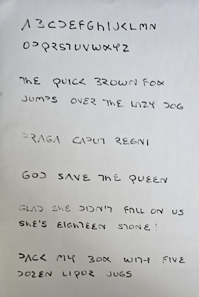
NB, the last sample sentence (liqor jugs) has the alternative – earlier – form of H. Imo it looks a bit too much like a badly written Y, that’s why I abandoned that design. On the other hand, the current H looks more like lower case h.
H is not the only troublemaker tho. Q also looks funny, doesn’t it, and in less precise writing, it may look uncomfortably close to conventional P. And in less precise writing, R and Z may look too similar.
Unfortunately, all the alternative forms of Q I figured out suffered from at least one mix-up problem (mostly looking too much like conventional P, or my own new Y), so I opted for this form. And the R / Z problem, well, easily solved by adding the vertical bit to R, but for purely aesthetics reasons, I didn’t want to do that (as it would be inconsistent with B, D and P. Hi ho!
Not sure this is all that practical, but as a little creative exercise before falling asleep, it was cool.